General de Seguros
UX/UI redesign
The Product
The Customer Virtual Platform is an internal web system for General de Seguros (and its subsidiary General de Salud) that lets employees manage the full lifecycle of an insured customer: search, creation, editing of personal data, addresses, documents, transactional profile and regulatory compliance (Art. 492, CONDUSEF, KYC/AML).
- Individuals, Corporations and Simplified Regime
- Management of two companies from a single platform
- Integrated regulatory-compliance modules
- Document management (INE, RFC, CURP, electronic signature)
User Roles Detected
- Customer consultation — Views but doesn't edit
- Customer administrator — Creates and edits complete profiles
- Customer compliance — Regulatory management and documents
- Customer supervisor — Oversight and approvals
- Customer identification — KYC and identity validation
Each role has differentiated access to the system's sections. The current design doesn't reflect this differentiation in the UI.
General system flow
1. Login
Username + Password
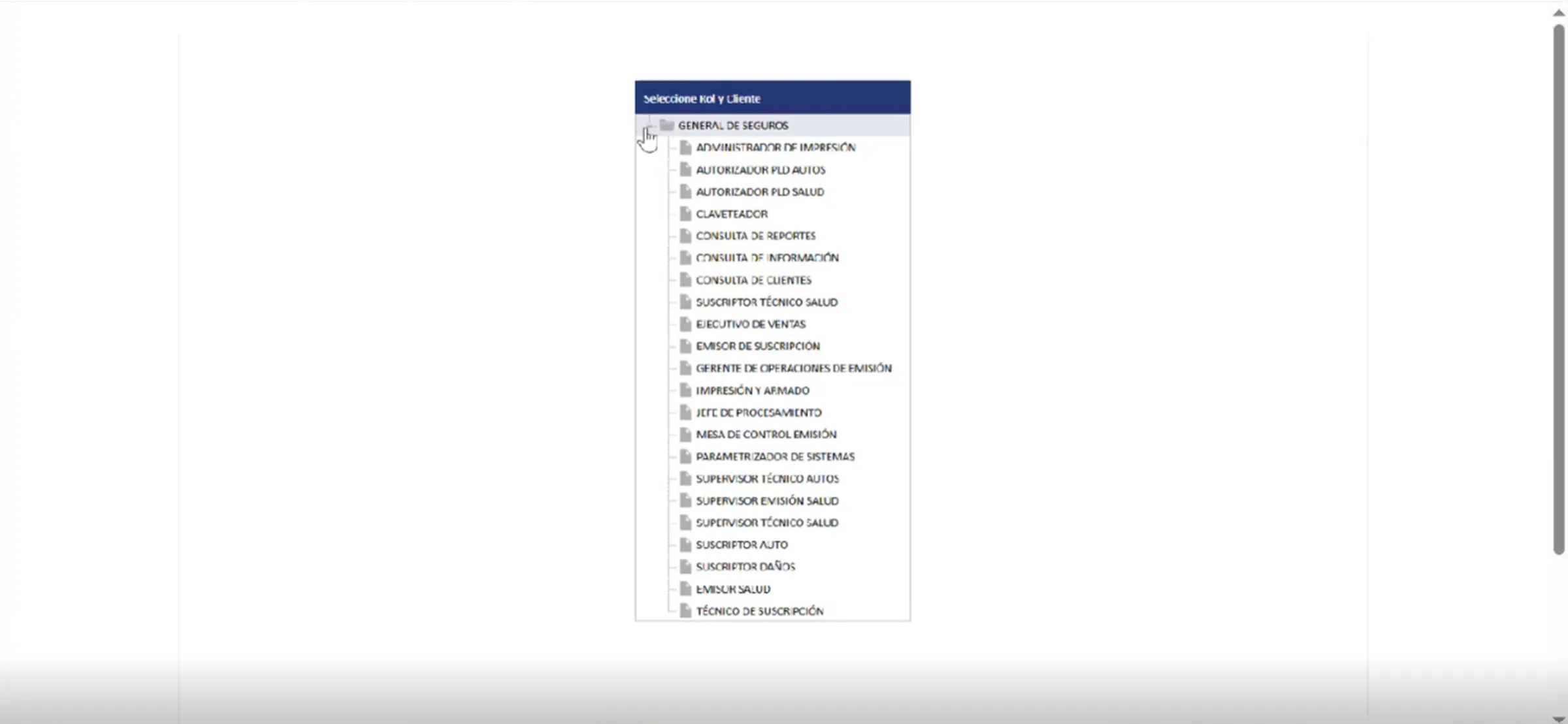
2. Role selection
5 available modules, with a list of subcategories
3. Company selection
Seguros or Salud
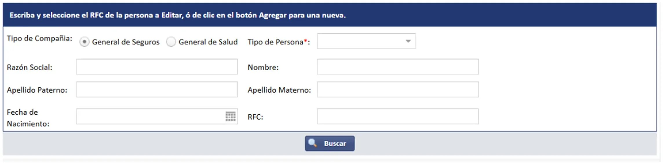
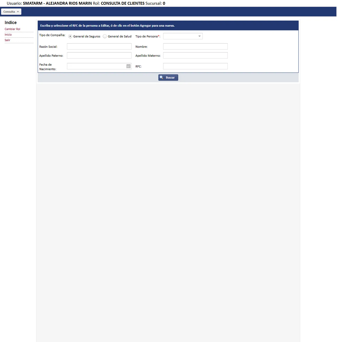
4. Person type
Individual / Corporation / Regime
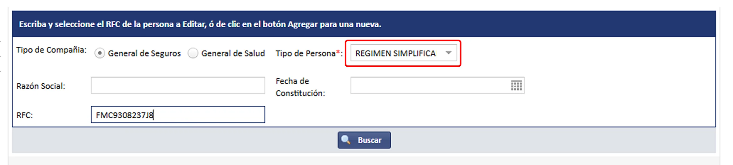
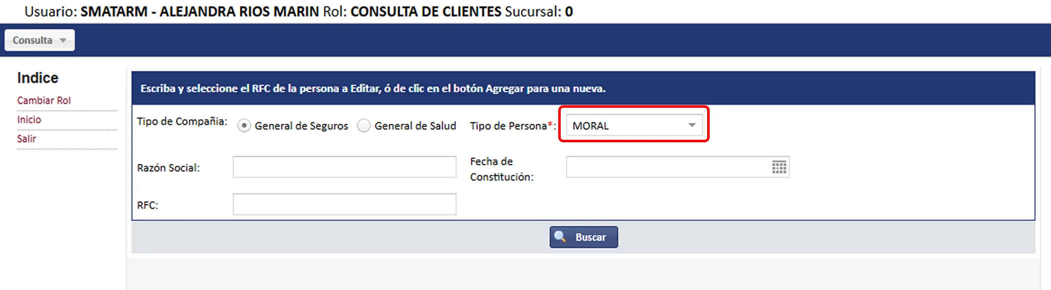
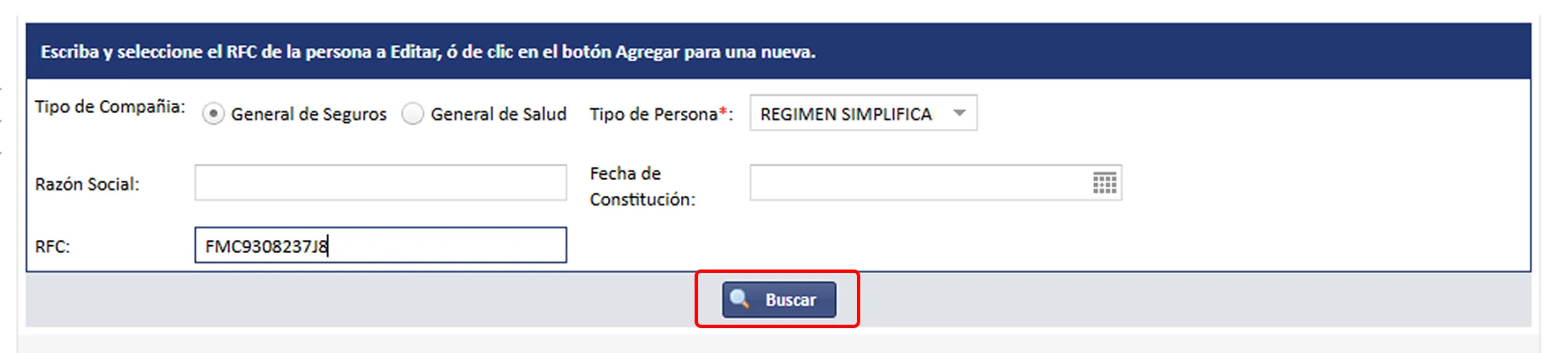
5. Search
Filters + Results
6. Customer profile
Full editing
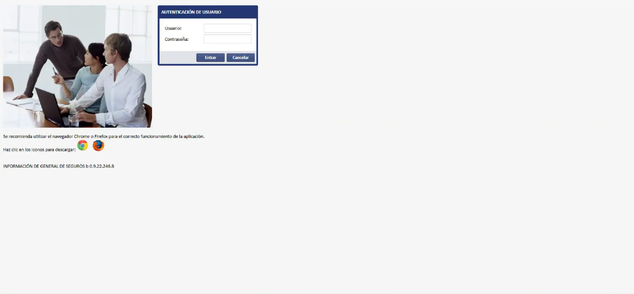
Legacy Platform (Before the Redesign)
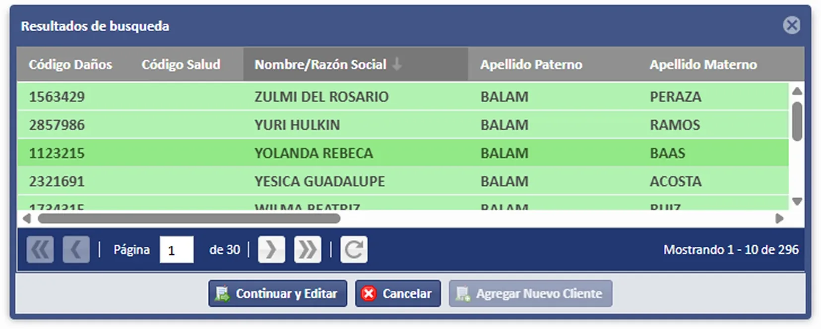
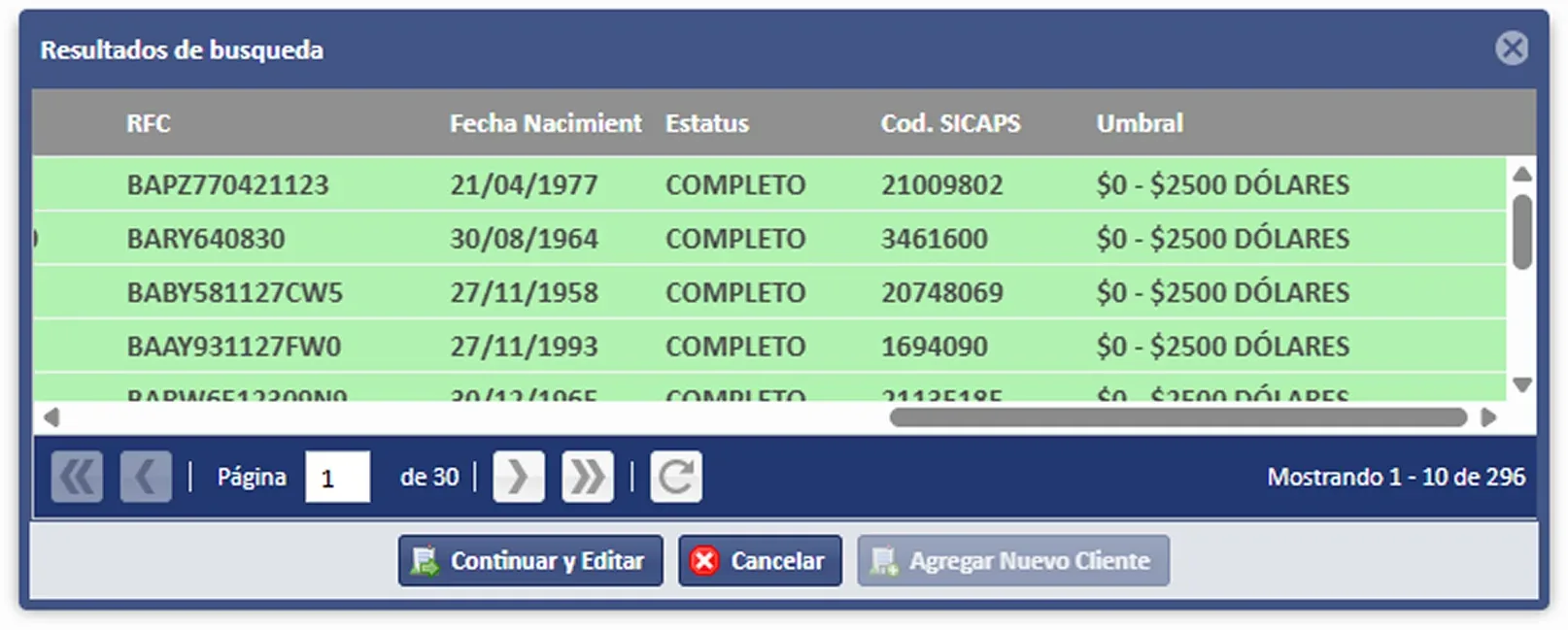
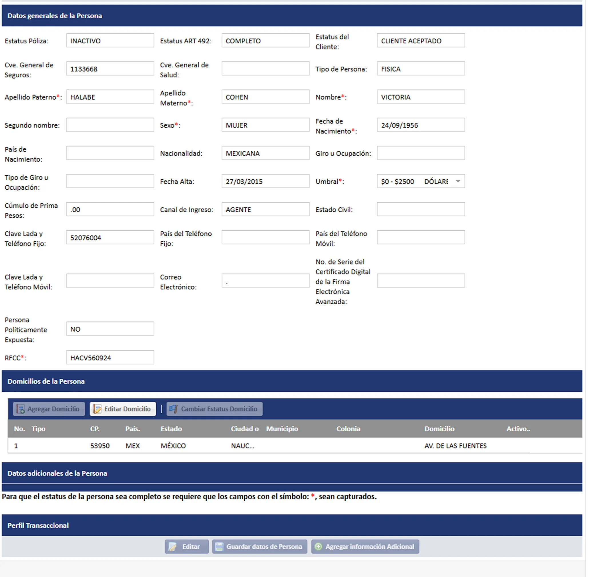
Diagnosis of the original Windows-style interface
"The original platform was a desktop application migrated to the web, with a dense interface, no design system, and heavily oriented to the database structure rather than the user flow."
— Observation from the technology team during discovery.
Inherited aesthetics
Windows XP/7-style UI: hard borders, dense tables, grey rectangular buttons, no clear visual hierarchy. A total absence of a design system.
Database-oriented
The forms exposed the internal DB structure: technical fields like "Cve. General de seguros", "Estatus Art. 492", "Cod. SICAPS" with no context for the user.
No status feedback
Actions with no visual confirmation, generic error messages, no loading indicators or designed empty states.
Confusing navigation
No breadcrumbs, no persistent side menu; the user lost context when navigating between sections. "Where am I?" was a constant question.
Excessive information density
Screens with 30+ fields visible simultaneously. No cognitive grouping. The user's eye had no clear entry point.
No accessibility
Insufficient contrast, small typography, no keyboard support, no ARIA roles. Unusable on small screens.
Comparative Table: Legacy Platform vs. Redesign
| Dimension | Legacy Platform | Proposed Redesign |
|---|---|---|
| Overall visuals | Windows XP: rigid borders, no spacing | Modern: clean design, legible typography, generous spacing |
| Design system | None: inconsistent components per screen | Partial: colour tokens and reusable components |
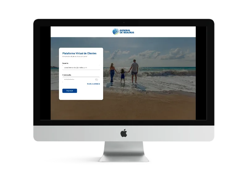
| Login | Basic: generic form with no brand identity | Improved: aspirational image + floating card + prominent logo |
| Module selection | Text menu: flat list of options | Visual cards: icons + name + "Go" button per module |
| Customer search | Single form: no steps, all fields visible | Progressive: company first, then type, then specific fields |
| Search results | Dense table: no hierarchy, fixed-px columns | Improved table: better legibility, visible "Edit customer" action |
| Customer form | One screen: everything together, no collapsible sections | Sections: General data / Addresses / Additional data / Transactional |
| Action feedback | None: no designed success/error states | Partial: yellow "No results found" banner (still improvable) |
| Responsiveness | Zero: desktop only, minimum 1280px screen | Basic: more flexible layout, but still no real mobile adaptation |
Redesign Analysis
What works well and what needs improvement
What the redesign got right
- Coherent brand identity: Prominent General de Seguros logo, institutional blue palette applied consistently.
- Typographic hierarchy: Section title with a left blue accent, description in grey, creating good orientation.
- Section separation: The customer profile is split into "General data", "Addresses", "Additional data" and "Transactional profile".
- Modal for addresses: Address editing uses a clean modal that doesn't lose the context of the main screen.
- Aspirational login: A family-on-the-beach image conveys the emotional benefit of insurance.
- User avatars: The user's name and visible avatar in the header give a sense of an active session and trust.
- Progressive dropdown: Search reveals fields according to the selected person type.
- Zero-results state: Informative banner when there are no matches in the search.
What the redesign still doesn't solve
- 3-step search flow: The initial "Customer consultation" screen is almost empty. The user can't search until completing 2 prior selectors.
- Customer-form density: 20+ fields on screen simultaneously, with no real prioritisation or progressive grouping.
- Exposed technical terminology: "Estatus Art. 492", "Cod. SICAPS", "Cúmulo de prima pesos" with no explanatory tooltips.
- No persistent side navigation: There's no secondary menu to move between sections of the customer profile.
- No breadcrumbs: The user doesn't know how they reached the current screen or how to go back efficiently.
- Disconnected olive-green colour: Table headers and banners use an olive green (#7A9B4F) that doesn't appear in the main design system.
- Roles with no description: The "Role selection" cards only have a name and icon, with no description of what each module does.
- Modal with no "X" close: The address-editing modal has no visible close button in the corner.
- Table with no pagination: Search results show no pagination or number of results found.
Problems Detected
Classified by severity of impact on the user.
P1 · Search flow fragmented into unnecessary steps
Critical
The user must navigate 3 sequential screens (company → person type → search fields) before being able to search. The first screen is almost empty, creating a sense of a broken or incompletely loaded screen.
Impact: Increases task time on frequent searches. Agents run dozens of searches a day; every extra second multiplies exponentially.
P2 · Customer form excessively dense with no visual guidance
Critical
The "General data of the person" screen exposes 20+ fields simultaneously in a 5-column grid. There's no prioritisation of required vs. optional fields. The scroll is extensive (over 3000px tall on a complete individual record).
Impact: High data-entry error rate. Users skip important fields because they don't see them or find them out of place. Risk of regulatory non-compliance.
P3 · Internal technical terminology with no context
High
"Estatus Art. 492", "Cod. SICAPS", "Cúmulo de prima pesos", "Umbral", "Canal de ingreso" are regulatory or business technical terms that have no tooltip, contextual help or description for the user.
Impact: New or less experienced agents make data-entry errors. Dependence on verbal training to make up for UI deficiencies.
P4 · No secondary navigation or breadcrumbs
High
Once inside the customer profile, the user has no way to know which section they're in or how to navigate between sections without scrolling. The only way to "go back" is the generic "Back" button that returns to results with no confirmation.
Impact: User disorientation. Loss of unsaved changes when navigating. Increased task time for multi-section operations.
P5 · Role-selection system with no context
High
The "Role selection" screen shows 5 cards with an icon and name, but no description of what each module does. New users don't know which role to choose. There's no "favourite" or "last used" role.
Impact: An unnecessary extra step for users who always use the same module. Confusion when onboarding new agents.
P6 · Inconsistency in actions and CTAs
Medium
"Save changes" and "Save person data" exist as different buttons for similar actions. "Clear results" appears in different contexts with inconsistent iconography (sometimes with a trash icon, sometimes without).
Impact: Uncertainty about what each action saves. Risk of losing data by pressing the wrong action.
P7 · Results table with internal-data columns
Medium
"Código Daños", "Código Salud", "Cod. SICAPS" are internal system identifiers the agent doesn't use directly. They take up valuable space, leaving no room for more useful data such as the full name.
Impact: The agent can't visually identify the customer in the table. They must click "Edit customer" to see the full name.
P8 · Document management with no clear status
Medium
Digital documents (INE, RFC, CURP, electronic signature) use colour icons (green/red/yellow) to indicate status, but with no text label. A colour-blind user can't interpret the document status.
Impact: Compromised accessibility. Risk of KYC non-compliance by not uploading required documents because their absence isn't perceived.
Improvement Hypotheses
Based on the problems detected and expected behaviour patterns.
Unified search
We believe that if we consolidate the 3 search steps into a single screen with progressive field reveal, agents will be able to find their customers in under 30 seconds instead of the current 3-sequential-screen flow, which will reduce the average record-opening time by at least 40%.
KPI: Time to first result · Goal: <30 sec · Baseline: ~90 sec.
Form in guided steps (stepper)
We believe that if we split the customer form into 4 linear steps (Basic data → Contact → Address → Documents) with a visible progress indicator, the rate of incomplete records will drop 35% because the user receives clear guidance on what's left to complete.
KPI: % complete records at first save · Goal: +35% completeness · Proxy: "Complete" vs. "Incomplete" status.
Regulatory tooltips
We believe that if we add contextual tooltips to the 12 technical-terminology fields (Art. 492, SICAPS, threshold, etc.), data-entry errors in those specific fields will drop 50%, which will reduce manual post-entry corrections and improve data integrity.
KPI: Error rate in regulatory fields · Goal: -50% errors · Measurement: Edit reversions.
Default role and quick access
We believe that if we remember the user's last role and pre-select it on the roles screen (with the option to change), 70% of agents will go straight to the module they need, removing an unnecessary step in the daily flow.
KPI: % of users who change role vs. use the default · Goal: 70% use the default · Validate: Role-selection analytics.
Customer-centred results table
We believe that if we replace the internal-code columns with full name, RFC, status and creation date as main columns, the agent will be able to identify the right customer without opening their record, reducing clicks to the correct edit by 25%.
KPI: Clicks to edit the correct customer · Goal: -25% clicks · Measurement: Usability-testing sessions.
Ideation and Improvement Proposals
Concrete solutions ordered by implementation effort.
Unified search
Add a persistent global search field in the header that allows searching by name, RFC or code without going through the filters screen. For advanced search, the current flow is kept as a secondary option.
Effort: Medium · Impact: High
Form in guided steps (stepper)
Redesign the creation/editing form as a 4-step wizard with a progress indicator: 1) Basic personal data, 2) Contact and address, 3) Additional data and documents, 4) Transactional profile and compliance.
Effort: Medium · Impact: High
Regulatory tooltips
An ⓘ icon next to each technical field (Art. 492, SICAPS, threshold, accumulation) with a tooltip explaining: what the field is, what values it accepts, and an example. Linkable to internal regulatory documentation.
Effort: Low · Impact: High
Default role and quick access
Remember the user's last role and show it highlighted at the top of the roles screen. Add quick access from the user menu (header dropdown) to switch modules without returning to the role-selection screen.
Effort: Low · Impact: Medium
Customer-centred results table
Change the columns: Full name (first and highlighted), RFC, Person type, Company, Status, Creation date. Internal codes (SICAPS, Código Daños/Salud) move to hideable optional columns. Add pagination and a results counter.
Effort: Low · Impact: High
Side navigation in the profile
Add a sticky side menu on the customer-profile screen with anchors to each section (General data · Addresses · Additional data · Documents · Transactional profile). Highlight the active section on scroll. Removes the need for extensive scrolling.
Effort: Medium · Impact: High
Status notification system
Replace the generic yellow banner with a system of toasts and inline messages: success (green), error (red), warning (yellow) and loading (blue). Include context-specific messages: "Customer saved successfully" instead of a generic one.
Effort: Low · Impact: Medium
Visual documents panel
Redesign the documents section as a card panel: each document with its name, status (Valid/Expired/Pending) in text + colour, validity date, and actions (View, Replace, Delete). Remove the colour-only icons with no text.
Effort: Medium · Impact: High
Inline addresses section
Instead of the floating modal to edit addresses, expand the selected row of the addresses table directly (inline edit), showing the editing fields. Reduces context loss and allows comparing with other existing addresses.
Effort: Medium · Impact: Medium
Impact vs. Effort Matrix
| Initiative | User impact | Dev effort | Priority |
|---|---|---|---|
| Tooltips on technical fields | High | Low | Quick Win #1 |
| Redesigned results table | High | Low | Quick Win #2 |
| Toast/notification system | Medium | Low | Quick Win #3 |
| Favourite role and quick access | Medium | Low | Quick Win #4 |
| Unified search in header | High | Medium | Short term |
| Side navigation in profile (sticky) | High | Medium | Short term |
| Redesigned documents panel | High | Medium | Short term |
| Stepper for customer entry | High | High | Mid term |
| Inline address editing | Medium | Medium | Mid term |
Key Metrics to Monitor
Indicators to validate the success of the proposed improvements.
–40% — Reduction in average time to find a customer (from ~90 to ~30 sec.)
+35% — Increase in records with "Complete" status at first save
–50% — Reduction of errors in regulatory fields (Art. 492, SICAPS, threshold)
70% — Users who would use the default role without needing to change it in the selector
4.5+ — Internal NPS (1–5 scale) of agent satisfaction with the tool
–25% — Reduction in clicks to open the correct record in the results table
Proposed Roadmap
Implementation phases ordered by impact and complexity.
Phase 1 · Sprint 1–2 — Quick wins (0–4 weeks)
- Tooltips on all technical fields.
- Redesign of columns in the results table.
- Pagination and results counter.
- Success/error toast system.
- X button in the addresses modal.
- Favourite role remembered per session.
- Breadcrumbs on detail screens.
Phase 2 · Sprint 3–5 — Flow improvements (4–10 weeks)
- Global search in the header.
- Unification of the search flow (1 screen).
- Sticky side navigation in the customer profile.
- Documents panel with legible statuses.
- Unification of the colour system.
- Descriptions on role cards.
Phase 3 · Sprint 6–10 — Major restructuring (10–20 weeks)
- Stepper for customer creation and editing.
- Inline address editing (no modal).
- Formally documented Design System.
- Real-time validations in forms.
- No-role mode (autoredirect if there's only one role).
- Usability testing with real agents.
- WCAG 2.1 AA accessibility.
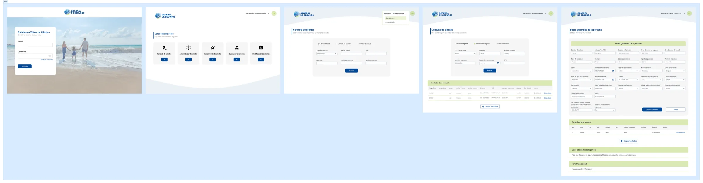
New Design
Conclusion
The redesign of General de Seguros' Customer Virtual Platform represents a significant step forward from the legacy platform: greater visual clarity, a present brand identity and a section structure. However, the system still carries inherited structural problems: a fragmented search flow, overly dense forms and context-free technical terminology that create daily friction for agents.
The improvement opportunities identified can be addressed incrementally: starting with low-effort, high-impact quick wins (tooltips, results table, notifications), moving toward flow improvements (unified search, side navigation) and culminating in the restructuring of the capture form using a guided stepper.
The ultimate goal is for General de Seguros' agents to complete their daily tasks faster, with fewer errors and greater confidence in the tool — which translates directly into better data quality, more robust regulatory compliance and higher job satisfaction.