ClientHub
Koywe's B2B portal where clients check the status of their orders and manage their on/off-ramp transactions without relying on technical support.
Context & goals
FixxyApp offers many kinds of services inside its app, from someone to mow your lawn to a babysitter.
Our business model aims at a services marketplace that's completely free for both users and vendors, so improving our engagement day to day is key.
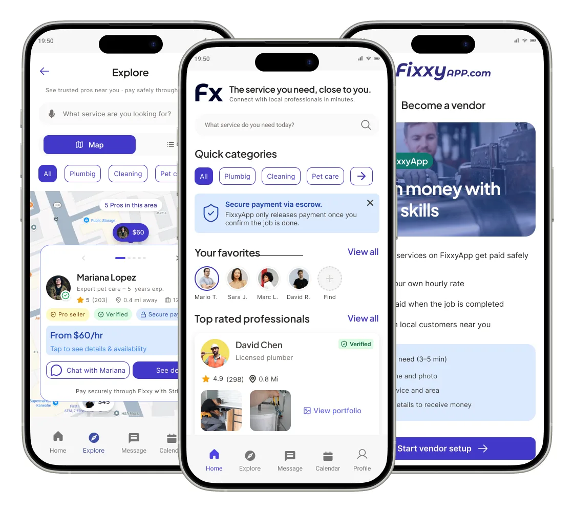
65% of users are interested in seeing images and/or videos related to the work vendors do.
80% of respondents buy services through local or general apps; this gives them the immediacy to meet their needs as soon as possible.
Audit & Benchmark
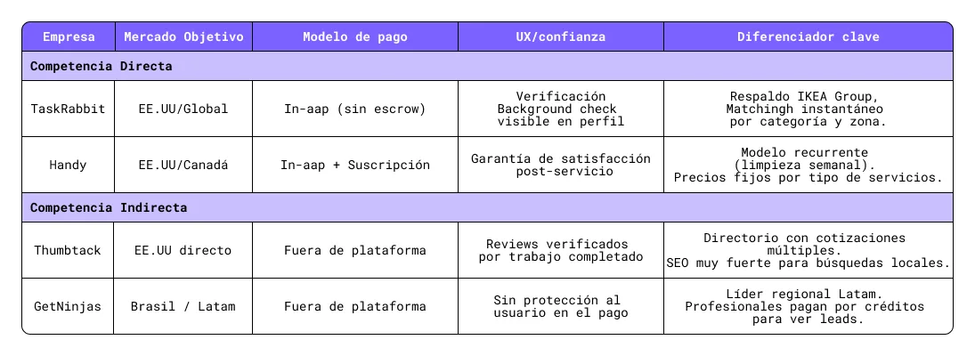
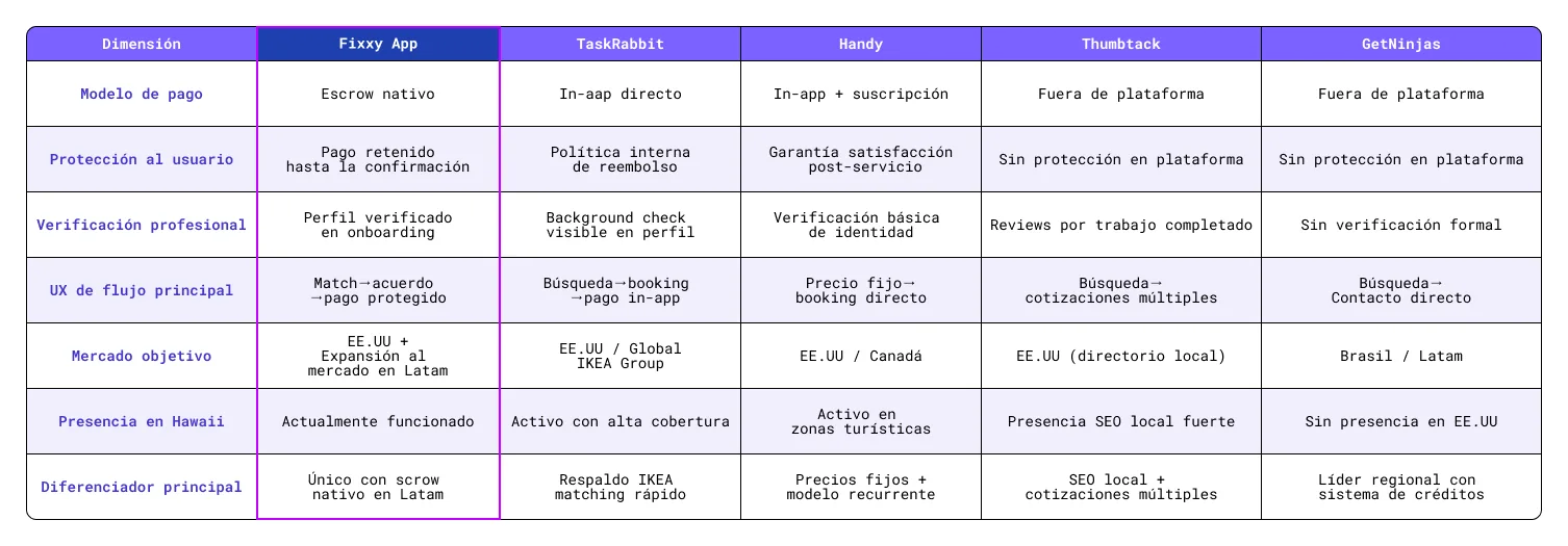
I analysed the current app and compared it with several US marketplaces, direct and indirect competition.
Direct competition
Same model, same user, same problem.
Indirect competition
They solve the same problem but with a different model or in an adjacent market.
The challenge
After analysing FixxyApp's interface, I identified 3 critical frictions that could limit user retention and create confusion during use of the app.
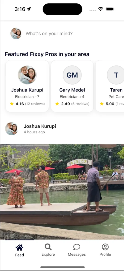
Problem: The current entry point uses a pattern similar to a social network, which doesn't align with the core intent of a services marketplace.
Engagement impact: Users get no immediate triggers to solve a specific need, which limits exploration and time spent, since they find no direct relevance from the very first moment.
Evidence: The feed shows large images with little contextual information about the usefulness, price or proximity of services.
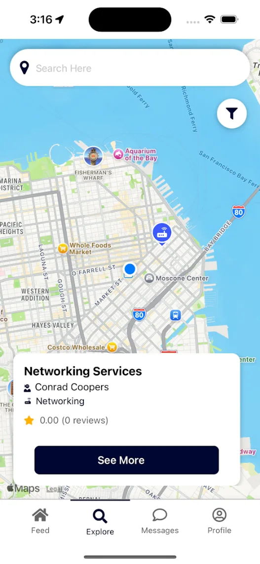
Problem: Map markers appear clustered, creating high visual and cognitive load.
Engagement impact: This forces the user into multiple trial-and-error attempts to find what they're looking for. This friction in geographic navigation discourages discovery of new services in the area.
Evidence: A user looking for an electrician can't visually tell them apart from a dog walker without interacting with each marker individually.
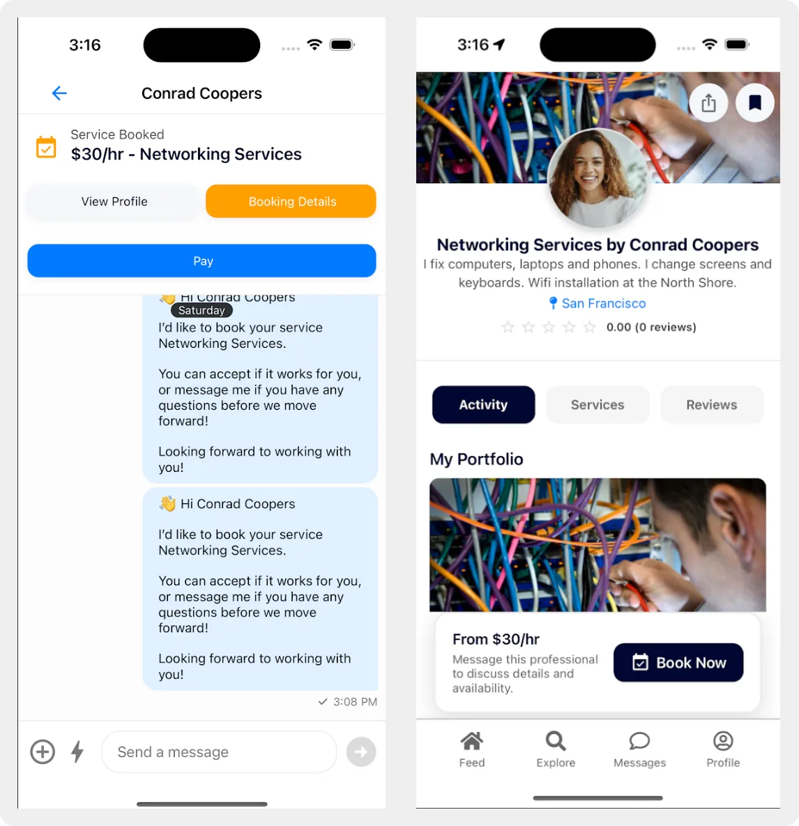
Problem: The booking flow is ambiguous and shows system messages that can be confusing when trying to hire a service.
Engagement impact: The lack of clear feedback on the next step creates uncertainty. If the user doesn't understand what happens to their money or their request, they're more likely to abandon the process before completing the transaction.
Evidence: Jumping straight from a booking button to a chat, with no clear confirmation of the request status, breaks the mental model of a safe, trustworthy transaction.
Opportunities
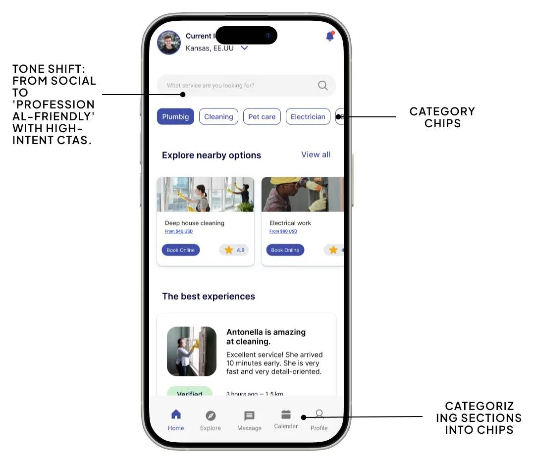
The main goal of the redesign is to move the app's perception away from a social network. To do so, the update goes beyond an aesthetic improvement; it introduces a professional yet approachable tone through the strategic use of calls to action (CTAs) across buttons and input fields.
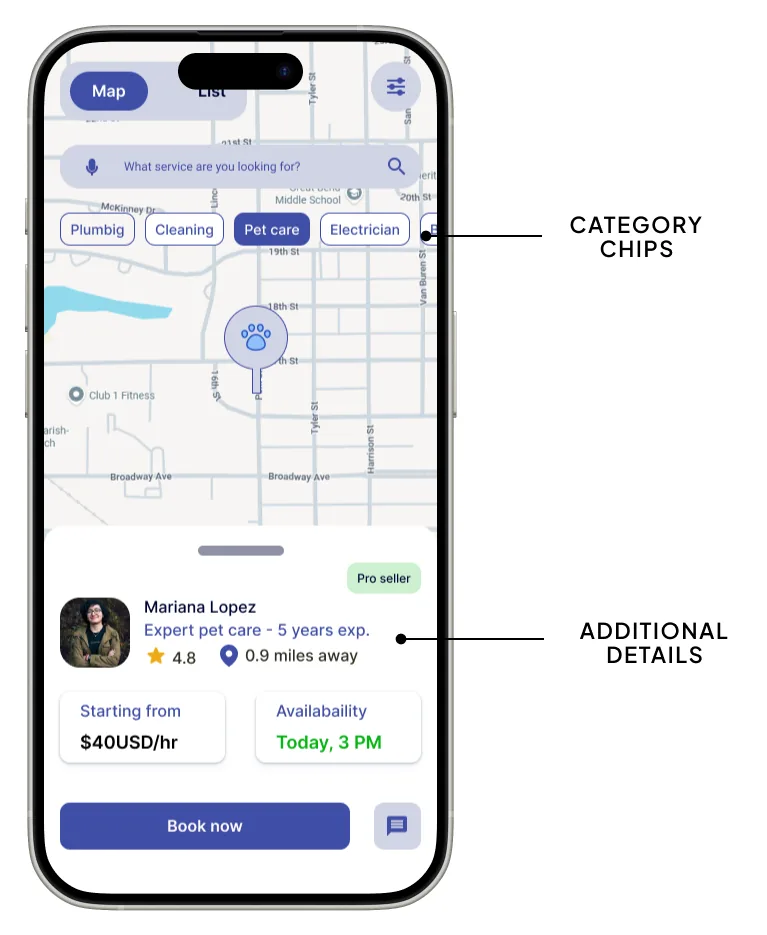
Adding interactive category chips (for example, Plumbing, Cleaning) right under the search bar makes navigation much faster than searching for professionals one by one through the map or the feed.
Unlike the current app, where the feed shows large images with no clear context, the new interface uses compact cards that show the service name, ratings and a visible action button, making discovery and decision-making easier.
The new design adds a section called "The best experiences", which shows detailed reviews with "Verified" badges, timestamps and exact distance (for example, "1.6 km"). In the current version shown in the video, the feed only displayed large photos with no information related to customer satisfaction.
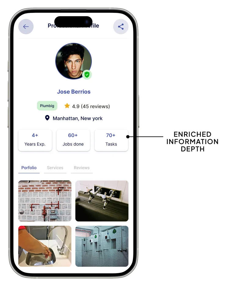
This improvement addresses one of the main frictions detected. Whereas the video showed a dog walker with mechanical tools in their portfolio, the new professional profile design (for example, José Berríos) shows images consistent with plumbing services, along with years of experience and the number of completed jobs.
A section called "Getting started is simple" was added inside the professional profile, clearly explaining the steps to hire a service: send a request, confirm availability and make a secure payment. This significantly reduces the uncertainty and anxiety of first-time users on the platform.
Engagement
In the original app, users landed on a generic feed with a structure similar to a social network, where they had to "guess" the next step.
Clear intent from the first second: By implementing a service-oriented search bar ("What service are you looking for?") together with category chips, much of the user's cognitive load is removed.
Quick access: Users no longer browse simply "to see what's available"; they now arrive with the goal of finding a specific solution, which considerably reduces the initial drop-off rate.
In the original app, all map markers appear clustered and undifferentiated by category, creating visual noise and hindering exploration.
Immediate visual feedback: By differentiating markers according to service type, the map turns into a dynamic and more intuitive exploration tool.
Discovery of unidentified needs: Sections like "Explore nearby options" or "The best experiences" encourage users to keep exploring the content, not for entertainment, but to discover relevant, valuable services. This significantly increases quality time spent inside the app.
The main barrier to interaction on local-services platforms is uncertainty in the face of the unknown. In the previous version, profiles were confusing and often contained images barely relevant to the service offered.
Real-time validation: Adding "Verified" badges, "Completed jobs" counters and testimonials that include exact distances (for example, "1.6 km") creates the perception of an active, trustworthy and transparent community.
The proximity effect: Knowing that someone located just 500 metres away had a positive experience provides the confidence the user needs to move to the next step and complete the service hire.
The original app left users in a state of uncertainty after attempting a booking, showing confusing system messages that interrupted the experience.
Action confirmation: The new "Success" screen together with the calendar integration properly close the user's psychological loop, delivering clear confirmation that the action was completed successfully.
Utility-driven retention: By adding a "Calendar" tab, the app stops being only a tool to search for services and also becomes a management tool. This encourages users to return to the platform regularly to manage their appointments, strengthening long-term retention.
First redesign iteration
The goal was to turn a generic social feed into a proactive hub focused on solving needs within the local marketplace.
Semantic search: The location-only search was replaced with a search field focused on user needs: "What service are you looking for?"
Category chips: A row of direct-access categories (Plumbing, Cleaning, etc.) was added, letting users segment services with a single tap and removing the cognitive load of unfiltered exploration.
To provide the context missing in the original app, the "The best experiences" section was designed:
Proximity and recency: Each review shows the exact distance (for example, "1.5 km") and the time elapsed since the experience, reinforcing the value proposition based on the immediacy and proximity of local services.
Trust signals: "Verified" badges were integrated to build instant credibility before the user opens a professional's profile.
The new professional profiles within the "The best professionals" section are designed to convey authority and trust:
Performance metrics: Indicators such as work volume (for example, "80+ jobs") and ratings obtained are clearly highlighted.
Direct access: A "View profile" CTA takes the user straight to the professional's work evidence, solving the detected problem of irrelevant or unrepresentative portfolios.
Calendar integration: A "Calendar" icon was added to the navigation bar, turning the app from a simple search tool into an end-to-end solution for managing services and appointments. This adds continuous value and encourages users to return regularly to the platform.
Geospatial exploration optimisation
Iconographic differentiation: Category-specific pins were implemented (for example, a paw print for pet services), letting users visually identify nearby services without needing to interact with each marker first.
Hybrid search and advanced filters: A search bar combining "service + location" was added, along with an advanced-filters button to segment results by distance radius, rating and availability.
Dual views (Map/List): A clear toggle was added to switch between map view and list view, adapting to users' different search mental models.
Quick-view card: When selecting a professional (for example, Mariana López), a card with key information is shown:
High-trust profiles
Wireframes
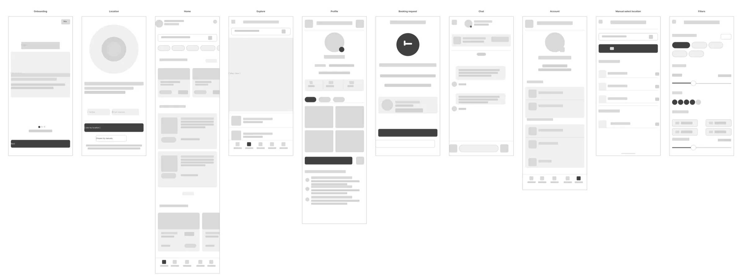
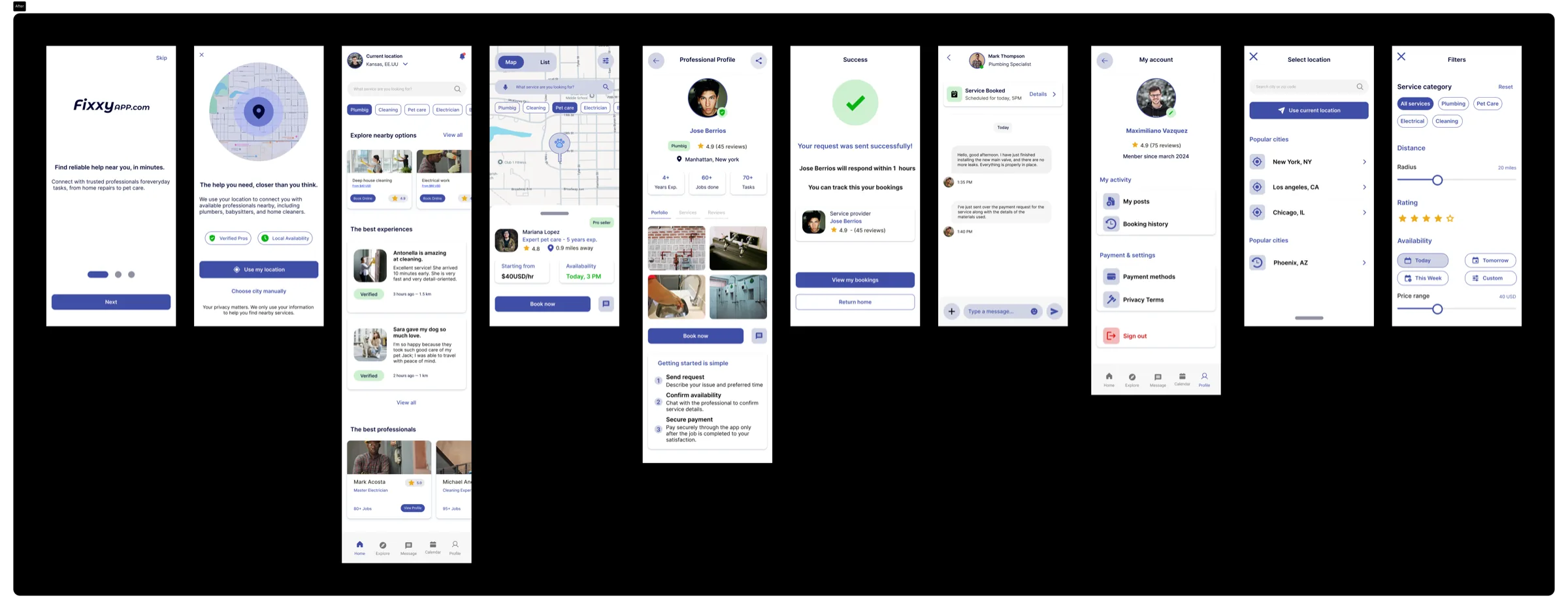
I started from the research findings to define key flows and information structure, then explored different alternatives in low-fidelity wireframes, iterated with the team and with users, and finally reached higher-fidelity versions ready to prototype and test.
Testing with real users
I ran usability tests with qualitative metrics to validate the changes that were made and to iterate the flow, delivering a higher-value service for our users.
Test steps
Estimated time: 3–5 seconds
Goal: Check what users understand when they see the new feed.
Questions:
Once the user answers these questions, we can provide a brief explanation of the current app. Using this as an initial ice-breaker activity, we continue with a moderated, task-based usability test.
Goal: Observe whether users understand the specific flow we're developing.
Typical tasks:
During the booking/payment simulation:
Best practices:
Sample size: 6–8 participants.
Profile: People who currently use or have used apps like Uber, Rappi, Uber Eats, Cornershop, Lyft, Instacart, TaskRabbit, Femm, Urban Company, etc.
Goal: See if they navigate the feed quickly, find services easily and evaluate their experience with the booking/payment flow.
Sample size: 4–6 participants.
Fields: Cleaning, gardening, electrical, plumbing, pet care, etc.
Goal:
Insights
Table ordered by insight number. Each insight is developed in detail on the following pages.
| # | Insight | Area | Risk | Impact | Effort |
|---|---|---|---|---|---|
| 01 | The tagline gets cut off and the app's value isn't immediately clear | Onboarding | High | High | Medium |
| 02 | Search isn't the hero — users don't know what to do first | Home Screen | High | High | Medium |
| 03 | 'Promoted' creates active distrust — users mentally filter those results out | Listings / Explore | High | High | Low |
| 04 | Lack of visual social proof — providers don't show finished work | Listings / Explore | Medium | High | Medium |
| 05 | Book Now executes without confirmation — creates anxiety and distrust in the flow | Booking Flow | High | High | High |
| 06 | Price inconsistency between views breaks trust right before paying | Booking Flow | Medium | High | Medium |
| 07 | Chat isn't perceived as a direct channel with the provider — reduces post-booking engagement | Chat / Communication | Medium | High | Low |
| 08 | The escrow system isn't communicated — users don't know their money is protected | Trust & Safety | High | High | Medium |
| 09 | No post-service evidence mechanism — users can't resolve disputes | Trust & Safety | Medium | Medium | High |
| 10 | Limited payment options — users with different payment habits are left out | Payment | Medium | Medium | High |
| 11 | No visible retention loop — users have no reason to return after the first service | Retention | High | High | High |
| 12 | The 'Verified' badge is the strongest trust signal — it isn't fully leveraged | Home Screen | Low | Medium | Low |
The improvements
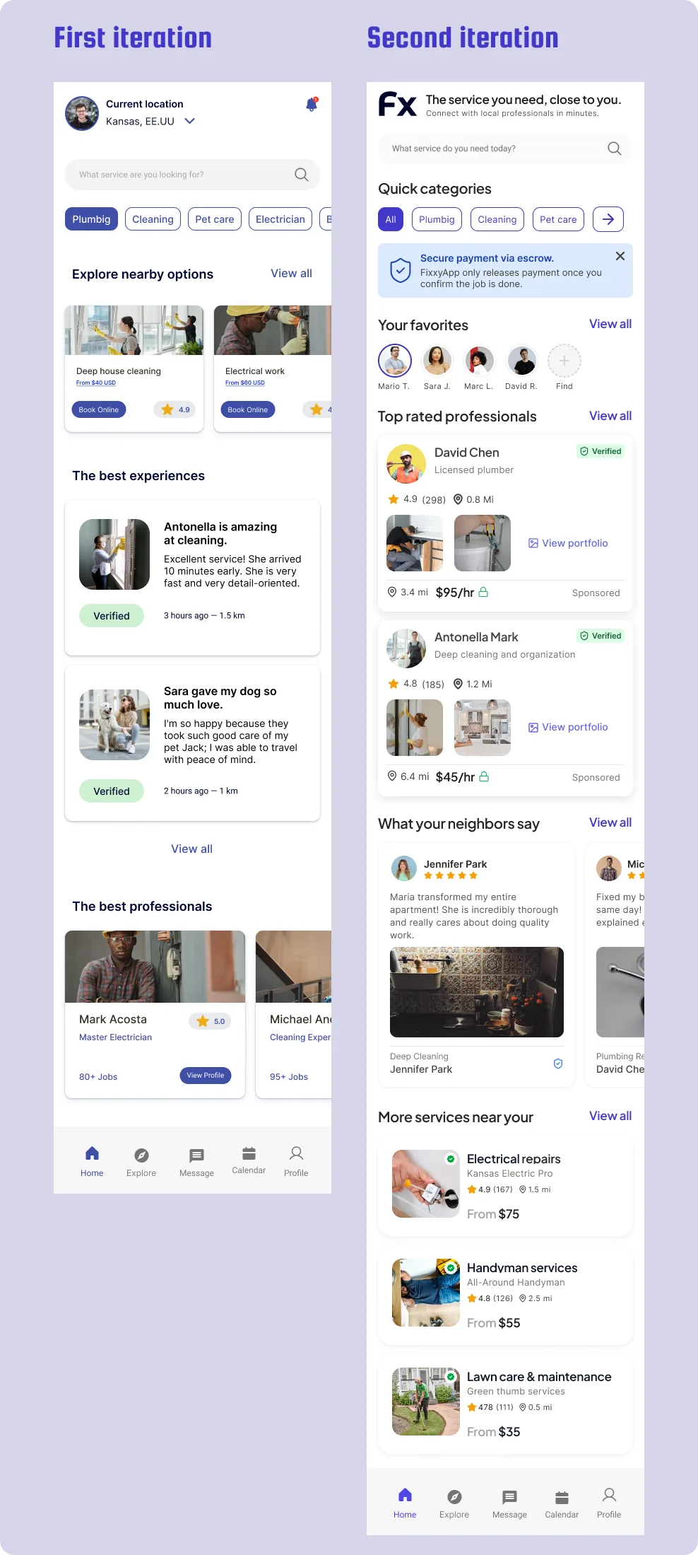
Before: The Feed screen didn't clearly communicate the app's value proposition, giving the impression it focused only on cleaning services. Navigation didn't encourage discovery or retention, and elements that would build trust or give reasons to return were missing.
After: The new Feed becomes a clearer, more attractive entry point, prioritising search, quick categories and relevant content. Trust signals like verified professionals, protected payments and social proof are added, plus personalised sections such as favourites and saved providers. The experience moves from a transactional tool to a space for continuous discovery of local services.
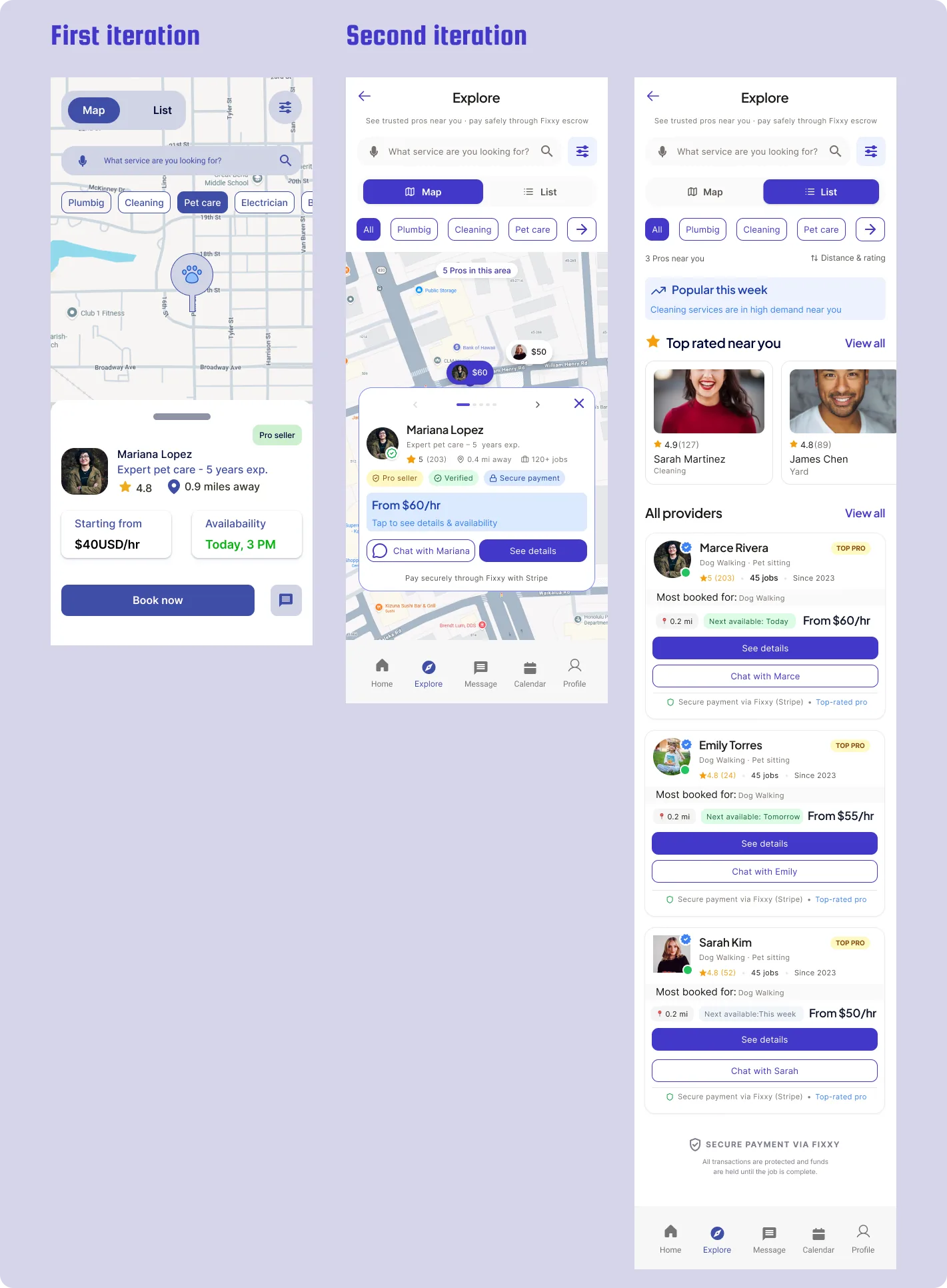
Before: Explore worked mainly as a basic map/list view, where users had little information to evaluate providers. The experience didn't provide enough context about prices, availability, service quality or payment security, raising doubts before booking. The chat wasn't clear and exploration felt limited.
After: Explore evolves into a more guided and trustworthy search tool. Map and List views are added, provider cards with relevant information, filters, visible prices and availability, plus trust signals like protected payment and verified professionals. The experience makes it easier to compare options, talk to providers and move more confidently towards booking.
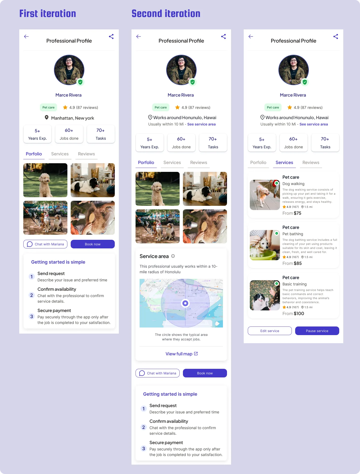
Before: The professional's profile worked mainly as an informational view, with little structure to help the user make a decision. Information about services, coverage and trust wasn't sufficiently organised, making it hard to assess whether the provider was a good fit before hiring.
After: The profile evolves into a more complete conversion tool, organised into three sections: Portfolio, Services and Reviews. Key information is added, such as service area, coverage map, service details and other users' reviews. In addition, the Chat and Book buttons stay visible to make hiring easy at any moment.
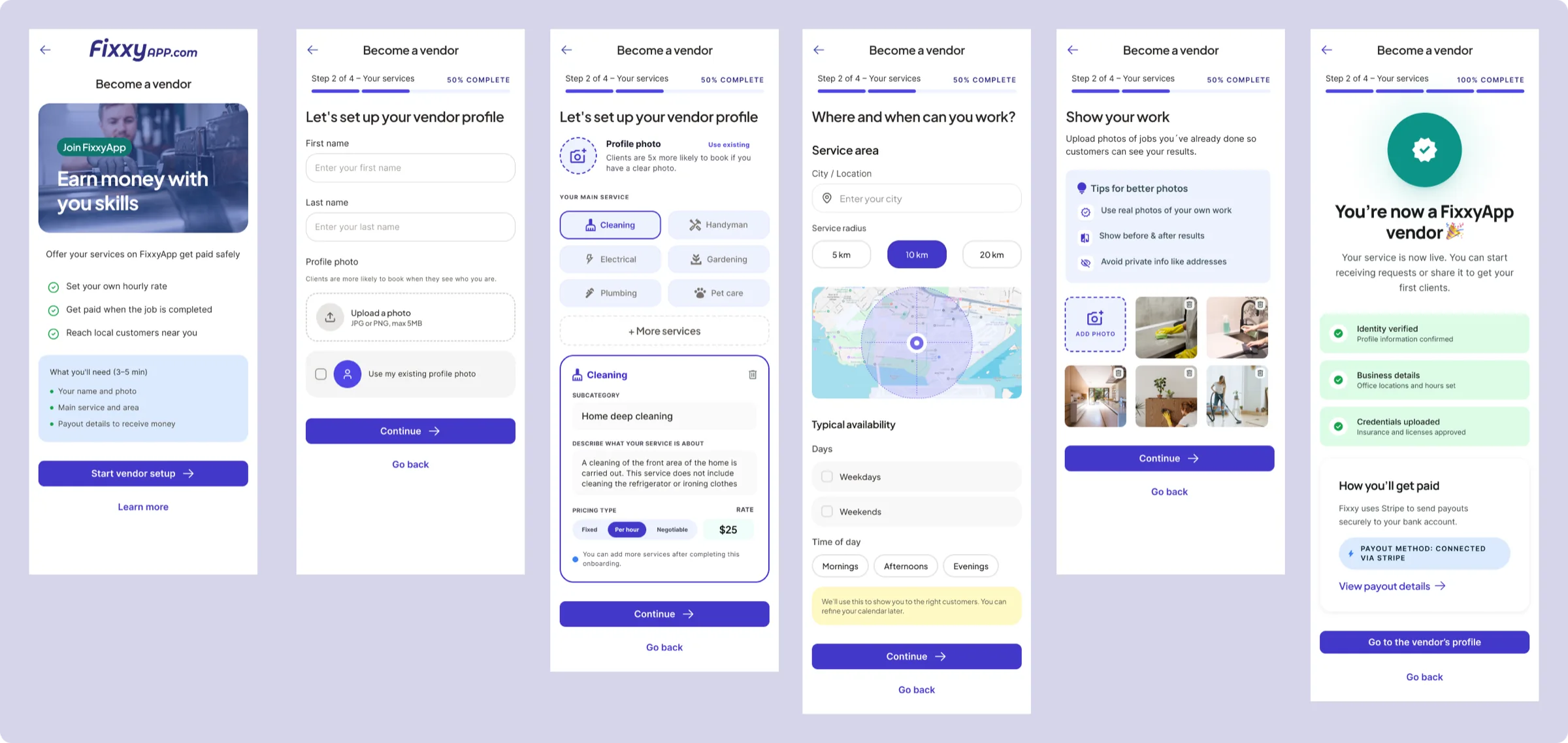
The platform had no clear flow for users to become service providers. There was no guided experience to configure professional information, define services, set availability or build trust before starting to receive requests.
A new Vendor registration and configuration flow is created, designed to turn a user into a professional ready to offer services within FixxyApp.
The process guides the user step by step to complete their profile:
The new flow turns becoming a provider into a guided experience, reducing friction and building trust. The user goes from having no presence on the platform to having a complete professional profile, ready to connect with clients and generate income.
Design System
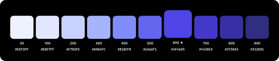
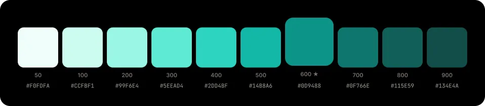
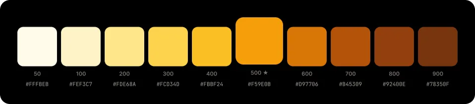
Warm Indigo as primary (trust + personality), Teal as secondary (freshness + verification), Amber as accent (warmth + energy).


Plus Jakarta Sans for headings (geometric, with personality) + Inter for body (designed for screens).
| Token | Size / Leading | Use | Recommendation |
|---|---|---|---|
| 4xl | 40px/48 · -1.0 | Display heading | Large hero screens only |
| 3xl | 34px/42 · -0.8 | Hero text | Title1 / display by space |
| 2xl | 28px/36 · -0.6 | Screen title | Title1 / display: more standard |
| xl | 24px/32 · -0.4 | Section title | Title2 — more presence |
| lg | 20px/28 · -0.3 | Card title | Title3 / headline |
| md | 17px/24 · -0.2 | Subtitle / Name | Headline / main body |
| base | 15px/22 · 0 | Body text | Subheadline → mainly body |
| sm | 13px/18 · +0.2 | Secondary labels, metadata | Footnote — for metadata |
| xs | 11px/16 · +0.4 | Captions, timestamps, badges | Caption2 — timestamps and badges |
| Regular 400 | Medium 500 | SemiBold 600 | Bold 700 |
|---|---|---|---|
| Body text, descriptions | Labels, subtitles | Buttons, links | Headings, prices |
4px base. Each step is a multiple of 4px for fine granularity on mobile.
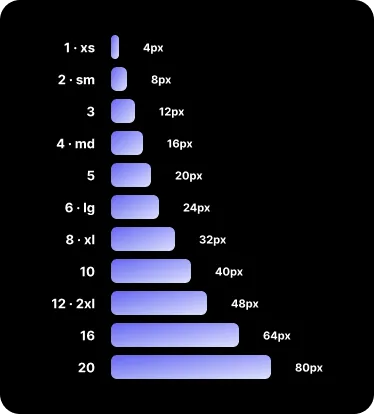
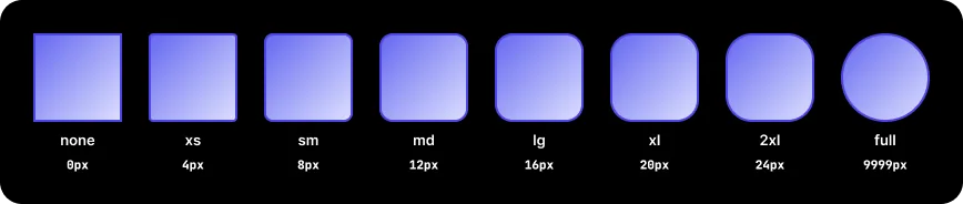
Rounded corners to convey approachability and warmth. A visual differentiator versus competitors.
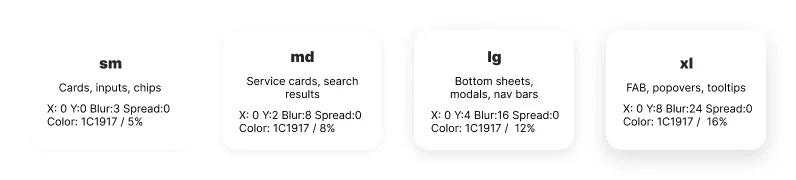
4 elevation levels. Shadows with a neutral-900 base to keep warmth.
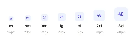
Phosphor Icons recommended. Friendly style with rounded corners. Variants: regular, fill, duotone.
What I learned
Trust isn't designed, it's built.
The most striking finding from testing was that escrow, which was Fixxy's strongest differentiator versus the competition, was invisible to users. No one knew their money was protected. It taught me that a technical feature with no clear UX communication simply doesn't exist for the user.
Users punish ambiguity more than errors.
The "Book Now without confirmation" insight (insight 05) was revealing: the button worked correctly, but the lack of feedback created more anxiety than an actual error. I learned that designing intermediate states —loading, processing, confirmed— is as important as the main flow.
"Promoted" destroys more than it sells.
Seeing that users mentally filtered out sponsored results (insight 03) changed my perspective on monetisation models. A free marketplace that introduces poorly integrated advertising can destroy the trust the rest of the design tried to build.
Validation
I ran usability tests using Figma's Motion feature to create a working prototype, optimising production resources and allowing me to validate the iterations and proposed improvements before final development.
These tests were run with both FixxyApp team stakeholders and end users, with the goal of validating the solution, gathering feedback and ensuring alignment with the business value proposition.
Thanks
I want to thank everyone who gave feedback and supported the continuous improvement of FixxyApp: Sebastián Castillo, Nicolás Arancibia, Johan Reyes, Taren Parley, Ganesh Vardhanapu and Mervin Raja.